Akin - Decaf Coffee Drink Packaging & Brand Design
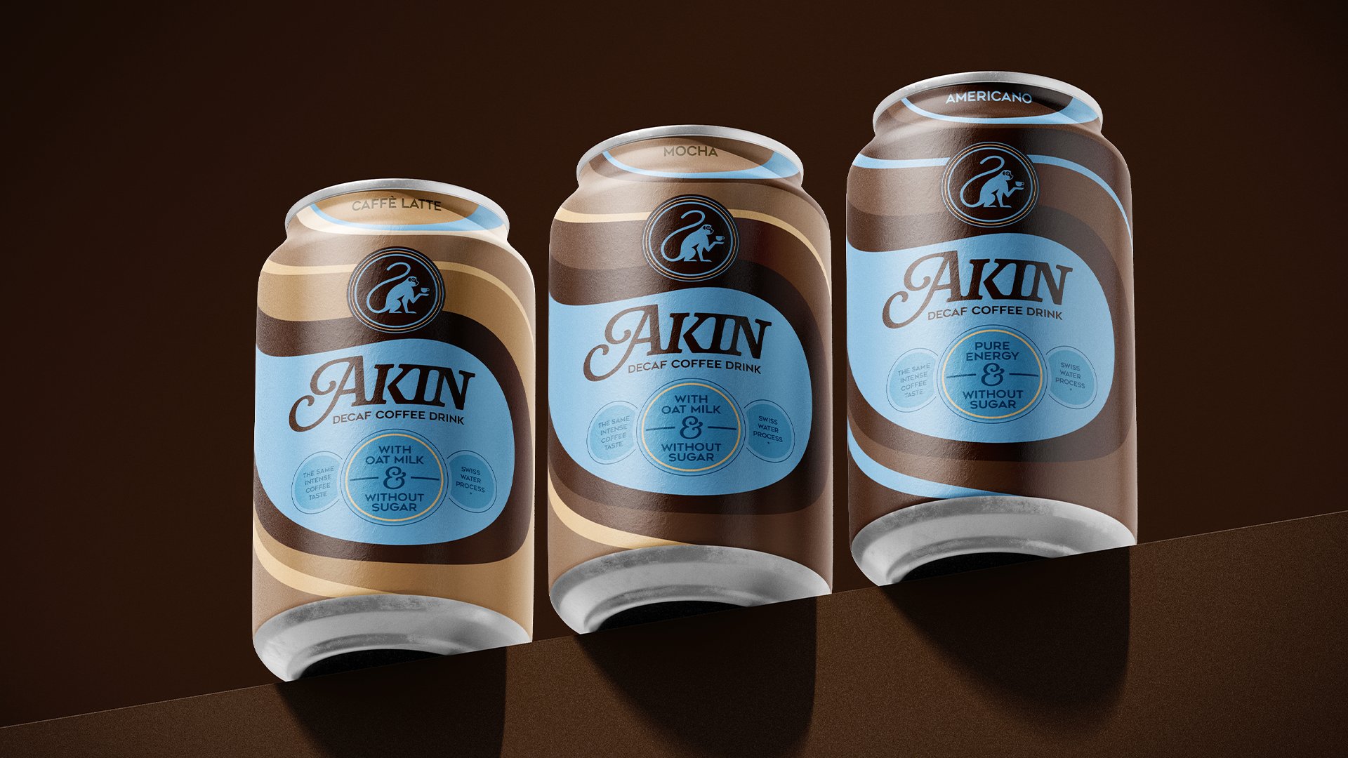
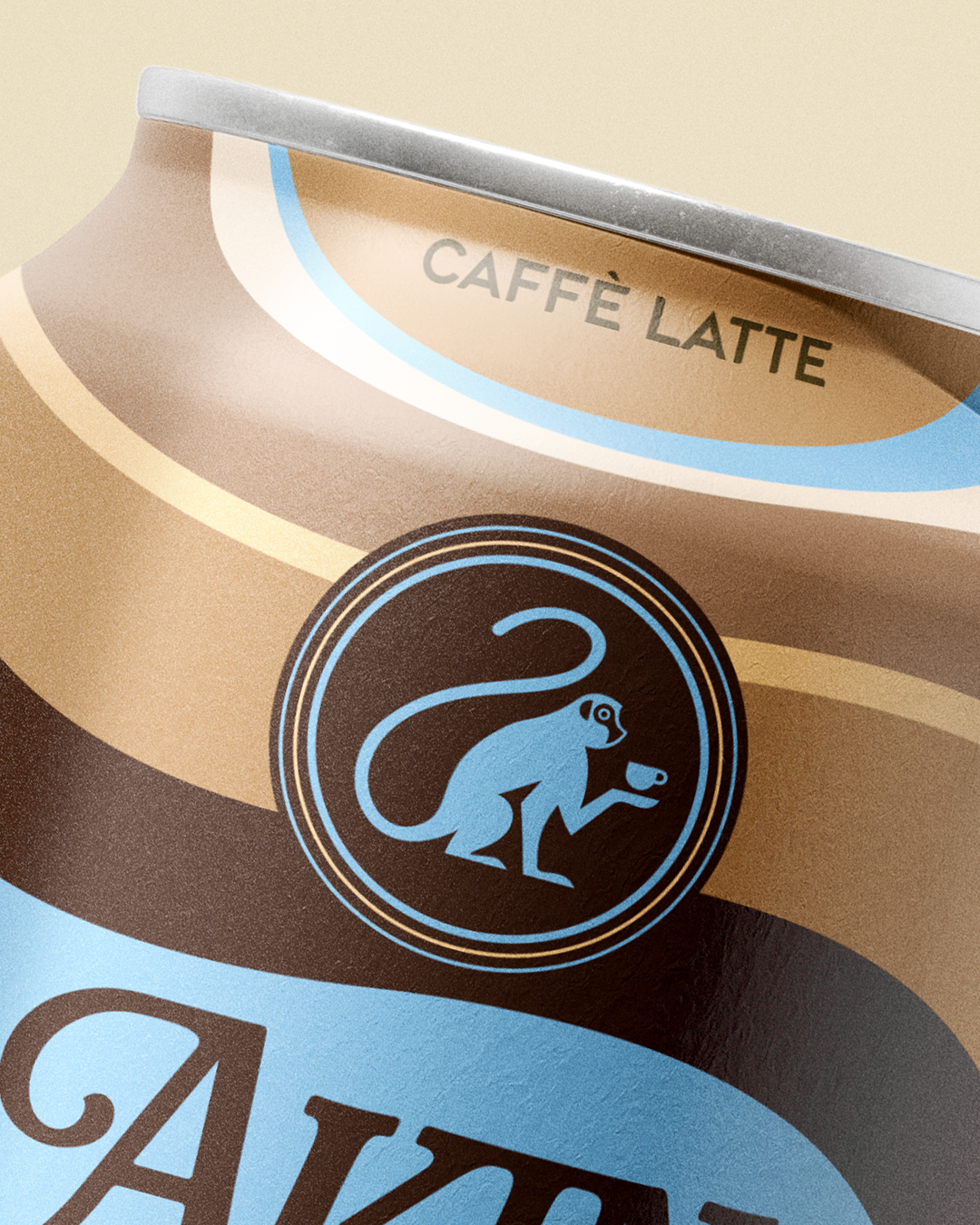
Akin is a conceptual brand and packaging design for a fictional line of ready-to-drink decaf coffee beverages. The idea was born from a personal insight - as a non-coffee drinker, I noticed a lack of appealing decaf options on the market. Akin is created for people who love the rich taste of coffee but prefer to skip the post-caffeine feeling. The brand is about listening to your body, embracing balance, and not forcing yourself to be artificially awake.The emblem - a monkey holding a coffee cup -symbolizes our similarity to other primates and evokes something familiar, warm, and comforting. It also references the meditative concept of the “monkey mind” - the restless state of thought. In Akin’s emblem, however, the monkey is calm and peaceful, representing mindfulness, acceptance, and emotional balance.
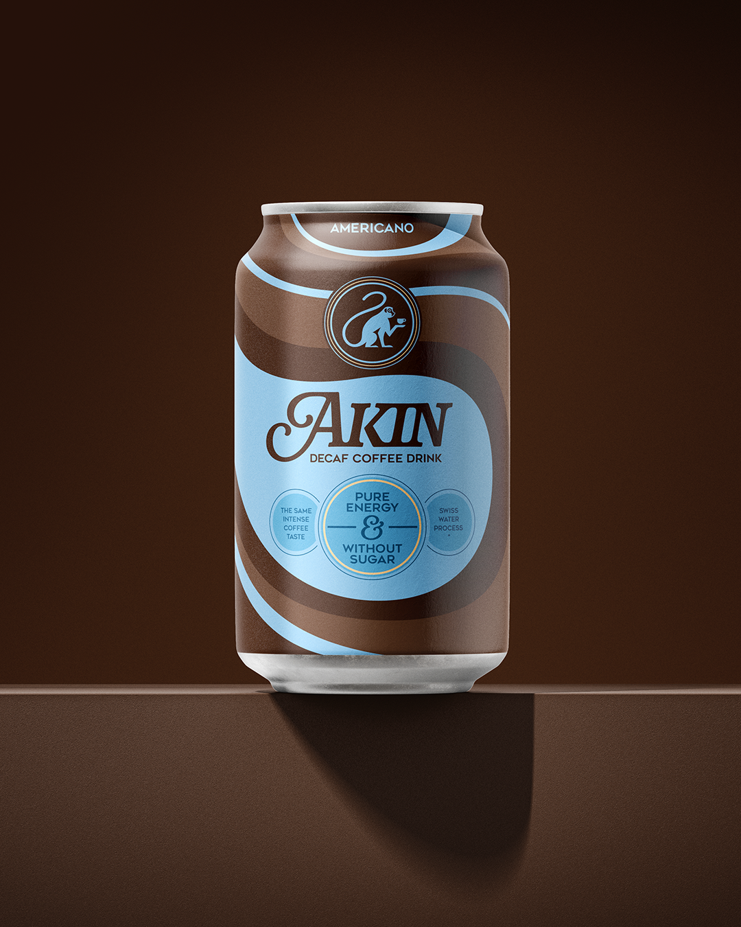
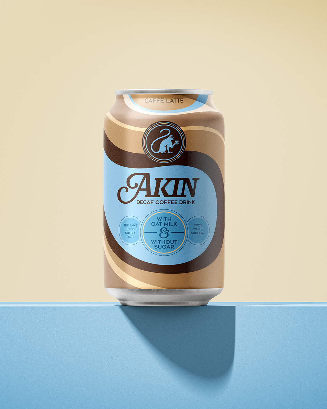
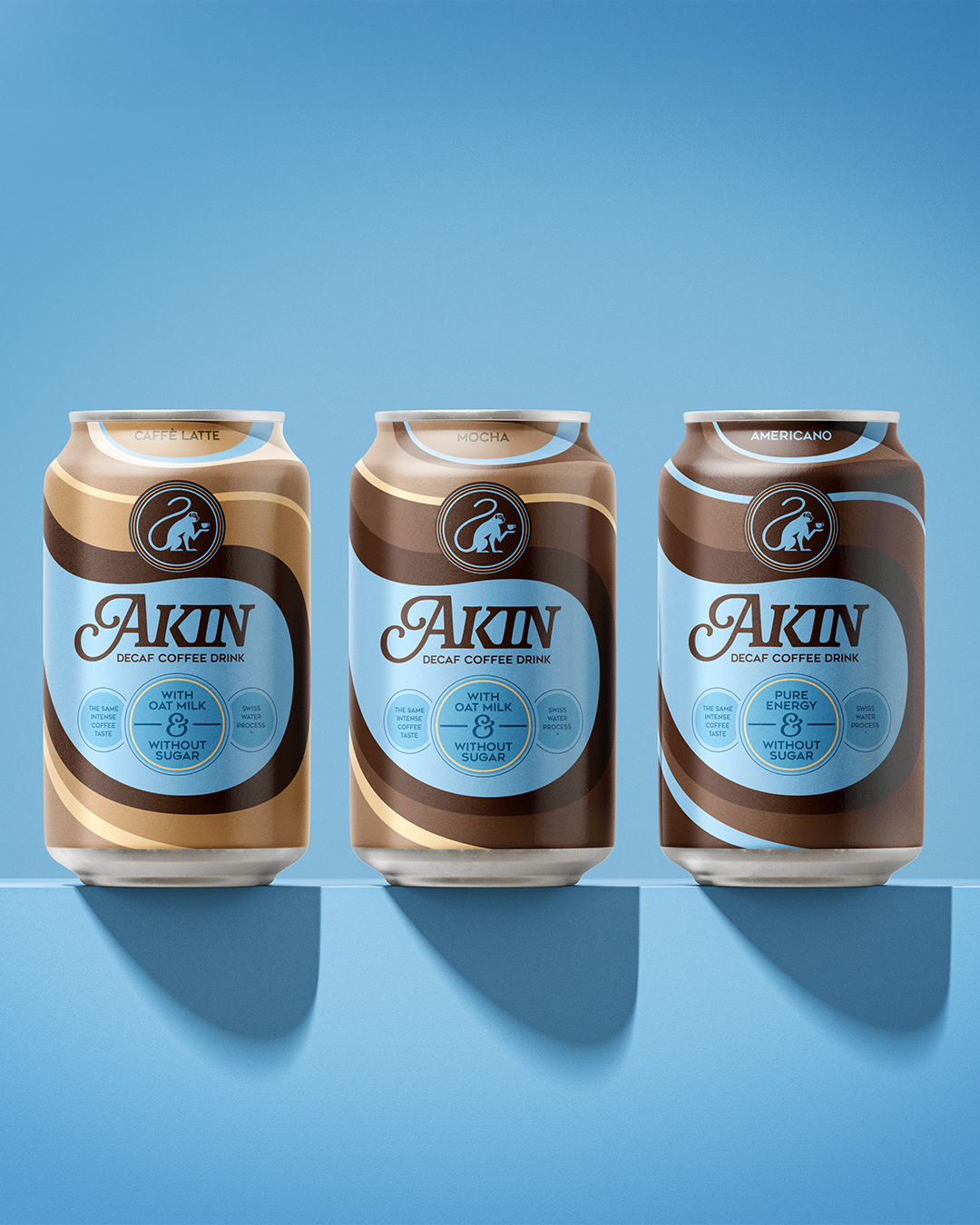
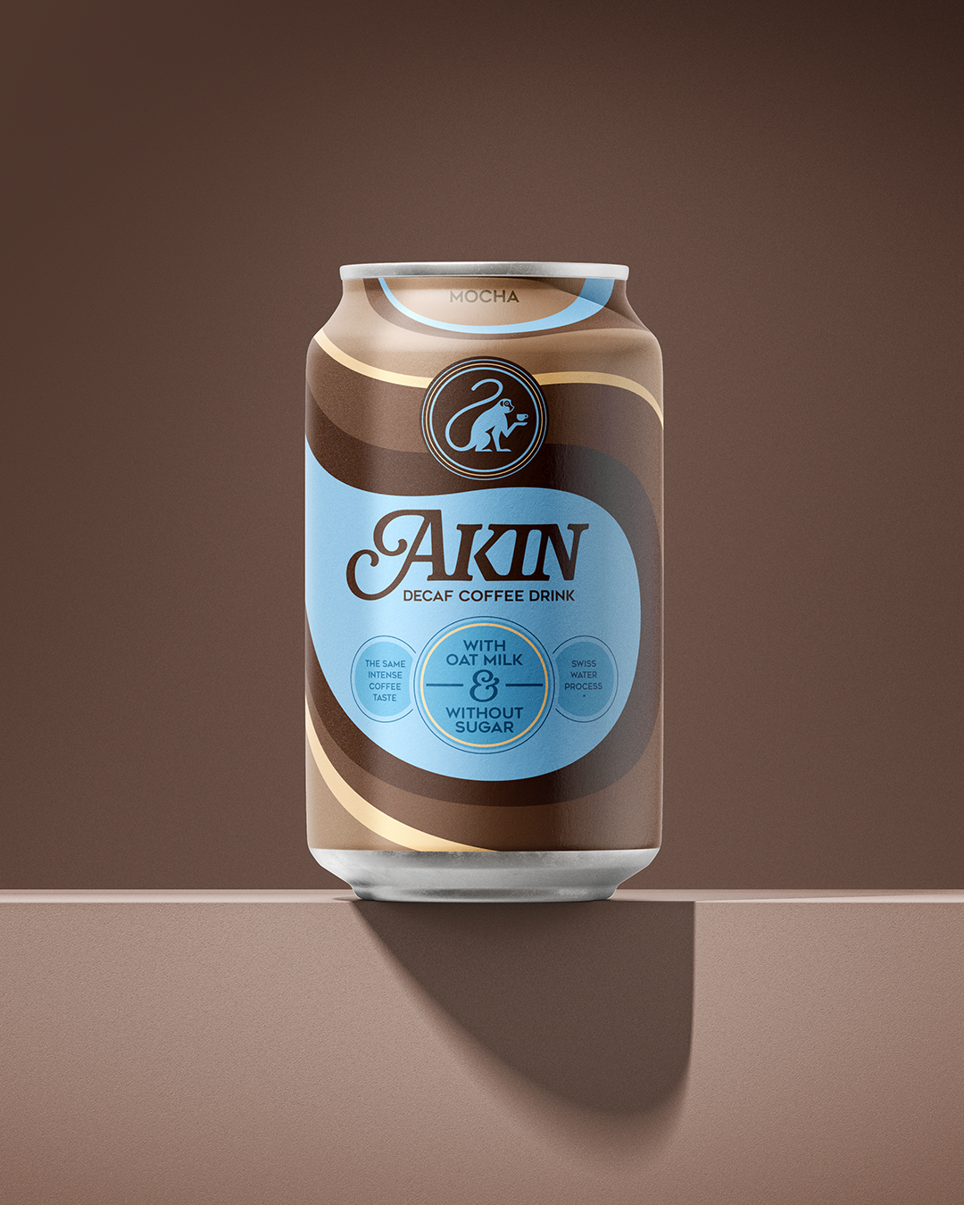
The brand’s main colors - blue and brown — define its visual identity. Blue, often associated with decaf coffee, helps the product stand out and be instantly recognizable on the shelf. Each drink - Latte, Mocha, and Americano - has its own palette while maintaining a consistent, structured design system. Latte features soft beige and light brown tones, Mocha presents deeper and richer browns, while Americano combines dark brown shades with subtle hints of blue. Together, they form a cohesive range that balances individuality with unity.
The dynamic interplay of blue and brown shapes draws inspiration from the yin and yang symbol, reflecting the idea of harmony and the permission to feel both awake or tired. The overall design language blends emotional storytelling, mindful symbolism, and clarity - inviting consumers to reconnect with their natural rhythm and enjoy coffee on their own terms.
